Streamlining Hydrogen Asset Management
Managing assets for a leading hydrogen producer was a challenge—fragmented workflows, siloed data, and an outdated dashboard slowed down teams and increased error rates. Ingenero was brought in to transform this experience through user-centered design.
100 min
79%
Task Success Rate
Saved everyday
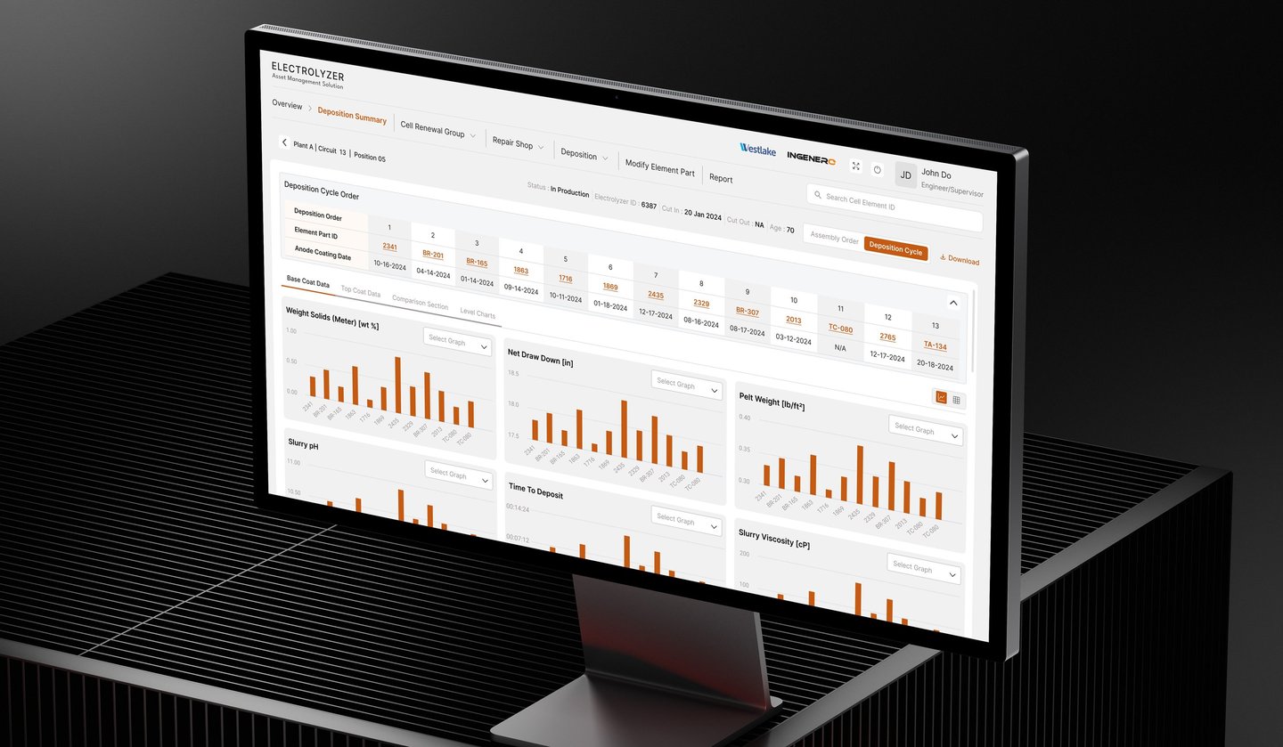
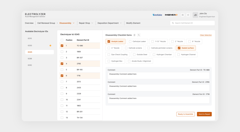
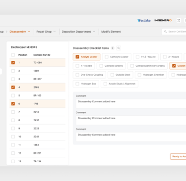
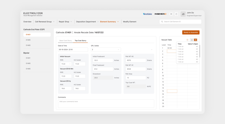
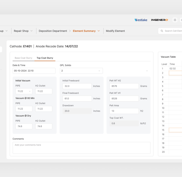
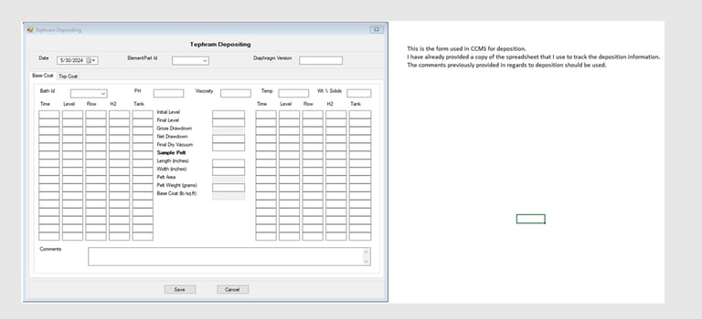
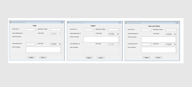
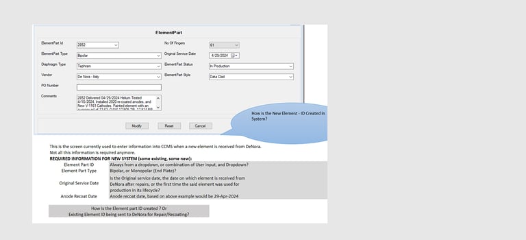
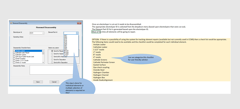
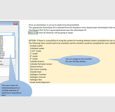
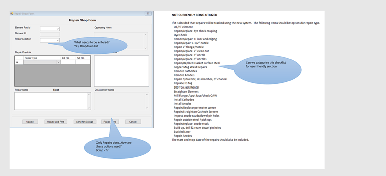
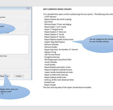
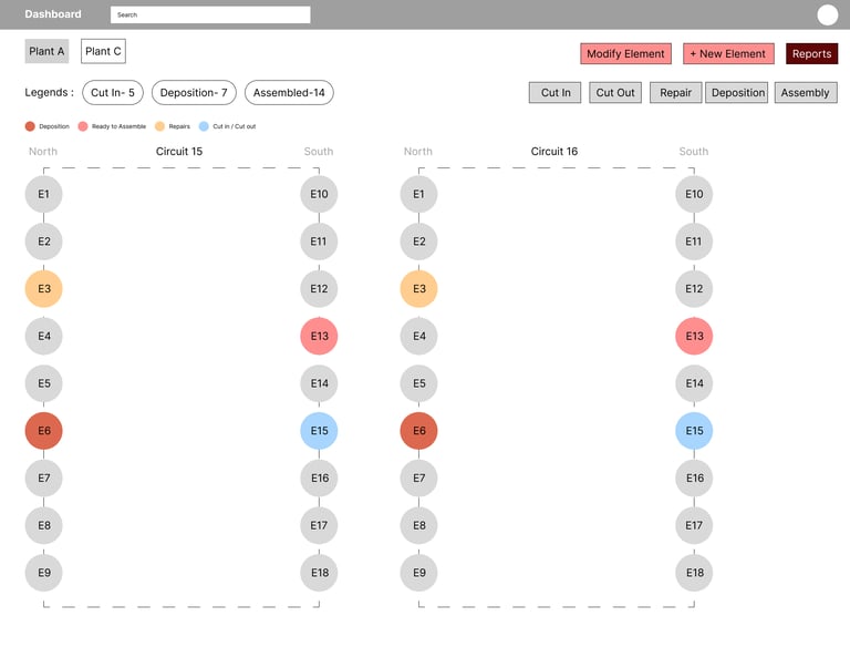
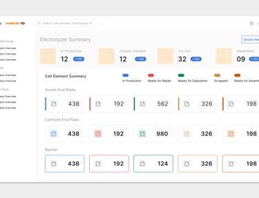
The legacy system scattered vital information across multiple interfaces, making it hard for users to track key cell elements like Anodes, Cathodes, and Diaphragms. With each department relying on accurate, long-term data, the lack of a unified view created bottlenecks, cognitive overload, and frequent mistakes.
The Challenge
5W1H
What
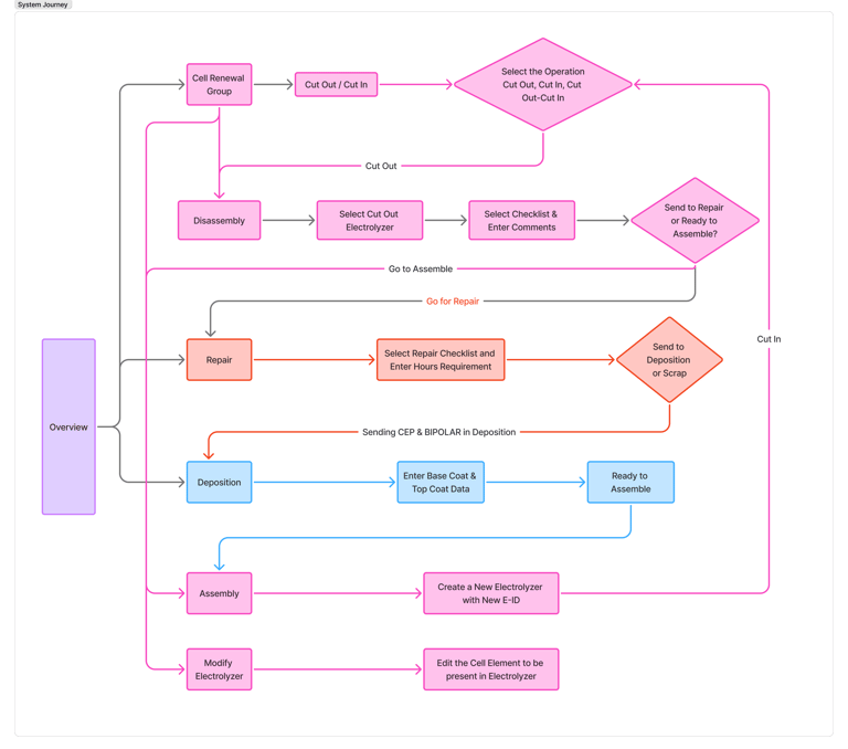
Creating a single view for various teams that are involved at collecting information on the repair lifecycle of various cell components.
Who
The dashboard’s users are specialized teams at a leading hydrogen producer, each responsible for different steps in the cell repair process. Each group uses the dashboard at their stage to track and update progress
There are three main user groups:
Cutters: remove components.
Disassemblers: separate individual cells of component
Decision makers: decide if cells are repaired or disposed
Who
Work was fragmented across tools, data lived in silos, and the old dashboard was hard to use. This slowed teams down and increased mistakes.
Where
Inside the company’s asset management environment—the day-to-day system people use to monitor and act on hydrogen assets.
When
After the organization recognized mounting inefficiencies and error rates with the existing dashboard; the result highlights are current outcomes from the redesign.
How
By applying user-centered design to:
Bring scattered workflows together in one place
Connect siloed data so teams see a single, dependable view
Modernize the dashboard to make core tasks faster and less error-prone
Problem Statment and Goal of the Project
This project will redesign the dashboard to reduce errors, improve efficiency, enhance information discovery, and streamline workflows across dependent user groups.
The current system’s design causes high error rates and user frustration due to excessive cognitive load and difficulty finding information, leading to inefficiencies and reduced effectiveness across interdependent user groups
Problems Identified
The existing system had a lot of other moving parts that could not focus on one core area or core group.
The user was struggling to identify the core information and there was a lot of clicks and eye movements for them, making wayfinding very difficult
The existing system lacked visual cues, affordance and distinction between elements like forms fields, buttons, links etc. making discovery very difficult.
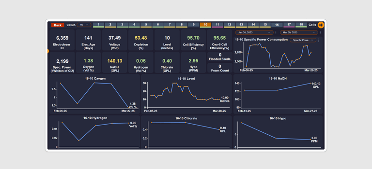
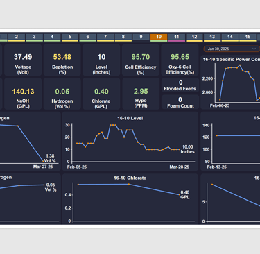
Lack of glanceability of the system.
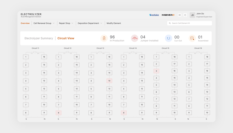
If the user wants to understand quickly what is the status of their plant, which cells need quick attention, which circuit needs faster resolution
Lack of visibility of systems, user was struggling to understand what is the system doing, how to prevent errors and how to go back. It becomes even more grave because the user have long forms that are already giving them stress
The design overall looked dated because of the time it was created on which obviously needs a fresh coat
Our mission: consolidate the dashboard into a single, intuitive platform. We started with stakeholder interviews and journey mapping to uncover pain points—poor glanceability, dated visuals, and high friction during task flows. Usability testing revealed excessive clicks, unclear affordances, and a lack of real-time feedback.
The UX Approach
Ideating Solutions
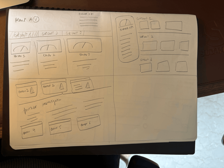
To unlock fresh perspectives, we began the ideation stage with a Crazy 8 exercise—a rapid sketching method that challenged the team to generate eight distinct dashboard concepts in just eight minutes. This approach sparked diverse ideas for streamlining navigation, improving glanceability, and enhancing error prevention.
Building on these sketches, we translated the best concepts into wireframes, focusing on information hierarchy, intuitive workflows, and clear visual cues. The wireframes allowed us to visualize solutions, gather early feedback, and iterate quickly before moving into high-fidelity prototypes.
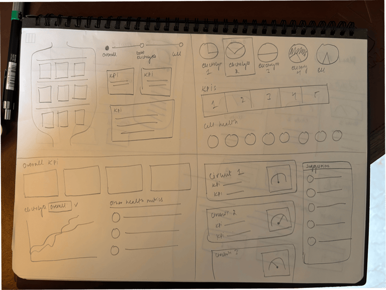
Explorations
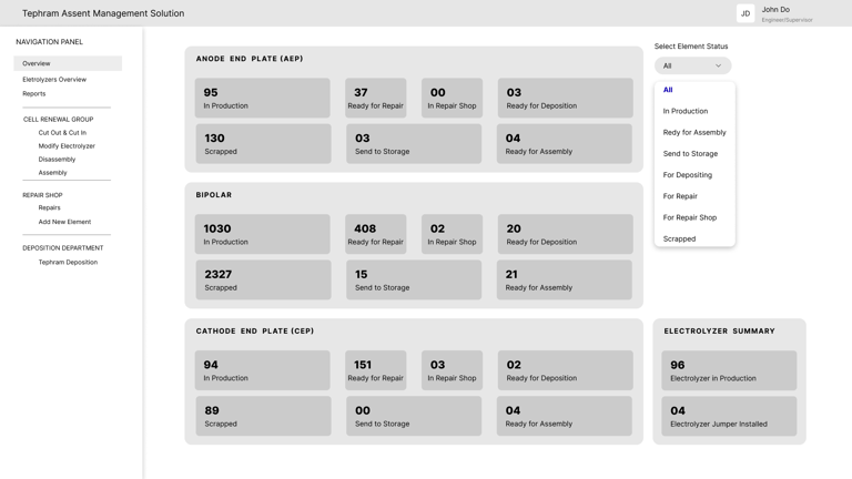
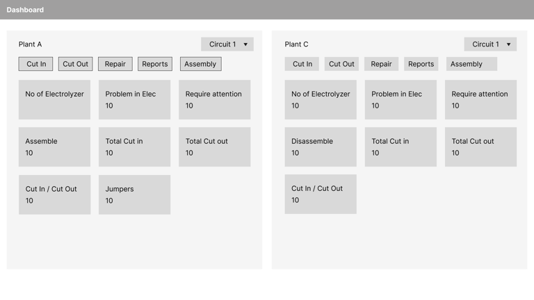
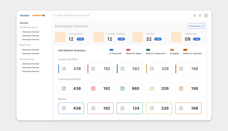
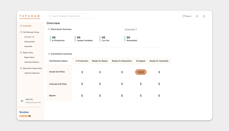
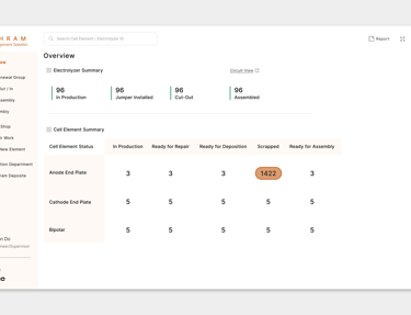
Information Architecture: Streamlined navigation and grouped related functions for faster access.
Visual Hierarchy: Refreshed UI with distinct visual cues for forms, buttons, and links, improving discoverability and reducing cognitive load.
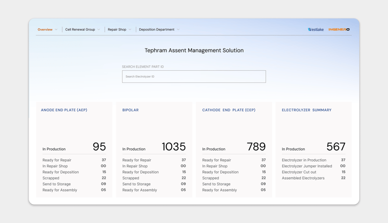
Responsibility-based Access: Custom views for each department, ensuring relevant data surfaced at the right time.
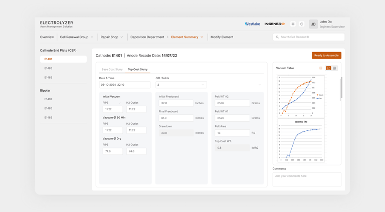
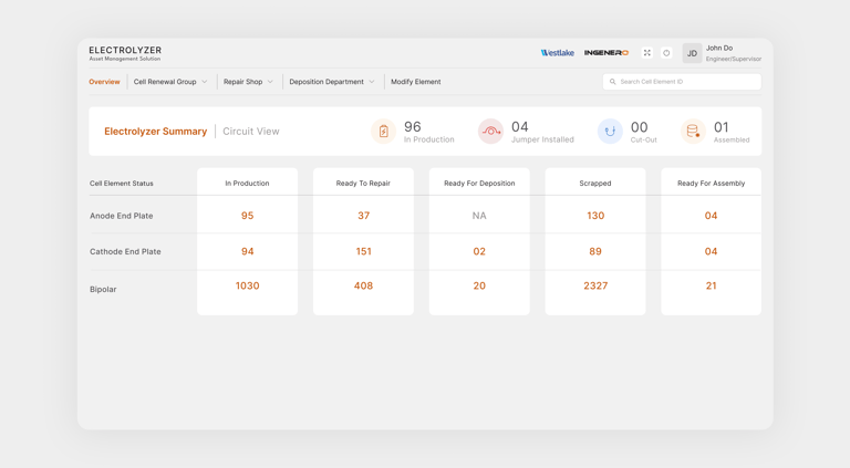
Real-Time Status: Live operational insights and end-to-end tracking for electrolyzer and cell elements.
Error Prevention: Contextual guidance and clear feedback to minimize mistakes during long, stressful workflows.
Reflection
This project showcased the power of UX strategy—by listening to users and iterating on solutions, we delivered a dashboard that’s not just functional, but delightful to use. The result: a unified asset management experience that empowers teams and drives operational excellence.