Plainfield App: HealthEquity for LGBT+
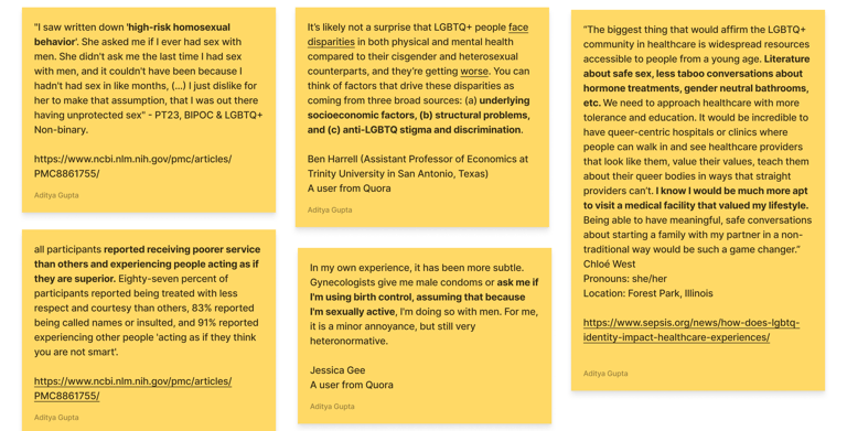
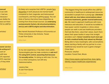
Accessing competent healthcare remains a challenge for the LGBTQIA+ community. Many individuals face stigma, lack of understanding from providers, and limited access to inclusive medical resources. These barriers contribute to unmet medical needs, reduced trust in healthcare systems, and wider health disparities that affect both physical and mental well-being.
87%
4/5
Trust & Inclusivity Score
Task Success Rate
LGBTQIA+ individuals face barriers in healthcare—stigma, uninformed providers, and lack of inclusive resources. This leads to unmet needs and mistrust.
Challenge and Process
Customized the Google Design Sprint for iterative, user-centric development.
Conducted desk research and literature review to identify key pain points: provider bias, fear of judgment, information gaps, and difficulty finding affirming care.
Explored broad solutions: telemedicine, advocacy, mental health tools, and directories for queer-sensitive providers.
Take a look at the video presentation

Research
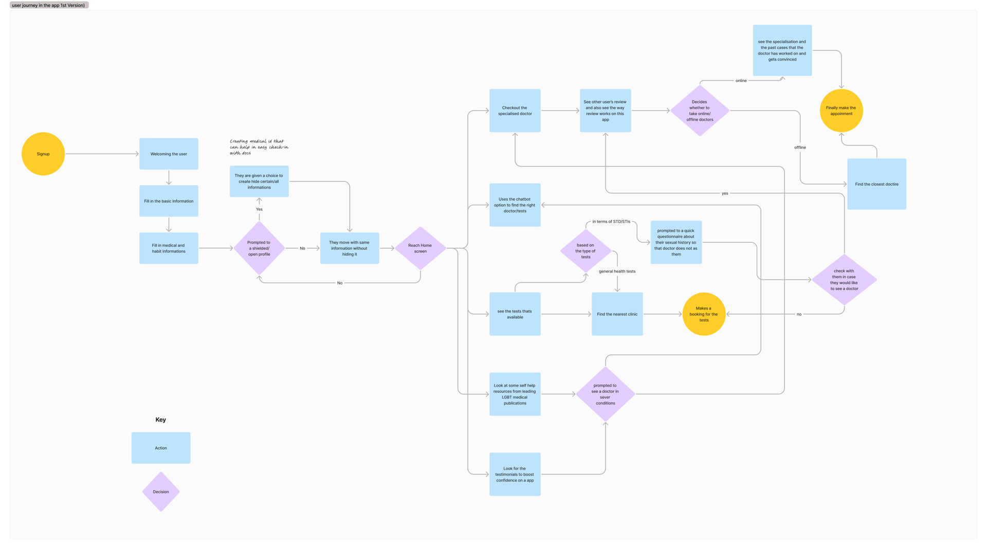
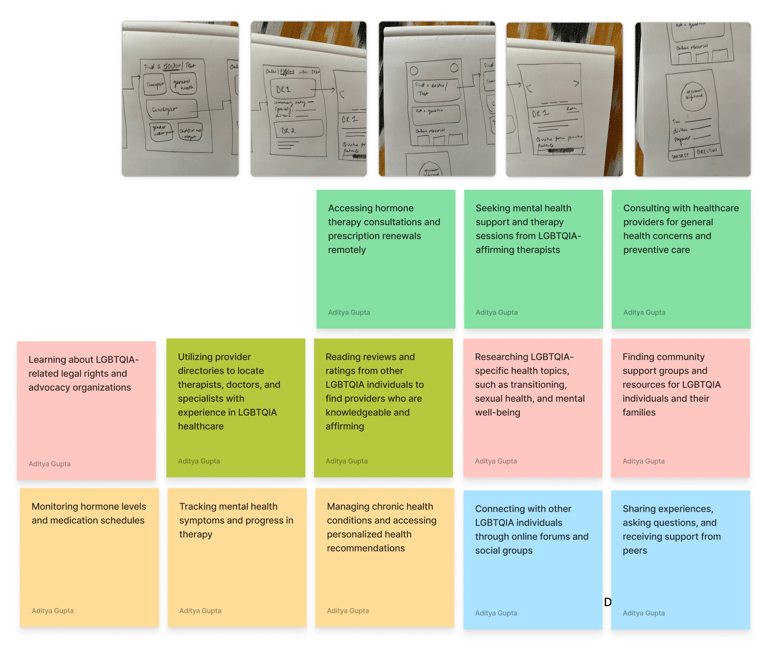
Our research phase combined desk studies, literature review, and user interviews to uncover core barriers in LGBTQIA+ healthcare: provider bias, fear of judgment, misinformation, and difficulty finding affirming providers. Mapping the user journey revealed critical moments—searching for doctors, booking appointments, accessing resources, and managing preventive health tasks. These insights shaped our design priorities, ensuring every feature directly addressed real user pain points and supported proactive, safe health management.
The design solution focused on removing barriers and building trust at every step of the user journey. By combining inclusive design principles with real user feedback, we crafted features and flows that empower LGBTQIA+ individuals to access healthcare safely, confidently, and proactively.
Ideation & Decisions that were taken
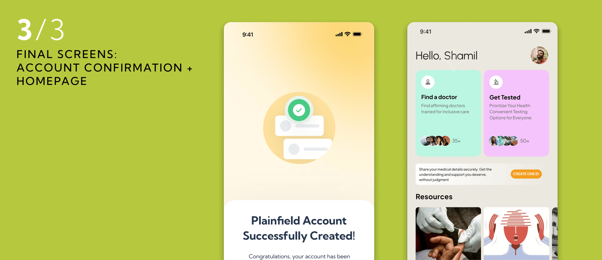
01. Optimizing Home Screen
Streamlined information architecture and visual
hierarchy for quick scanning.
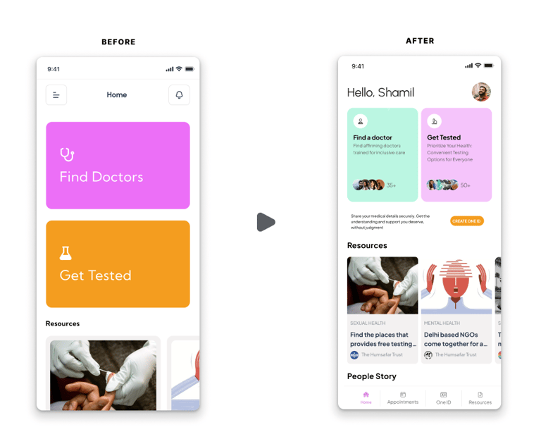
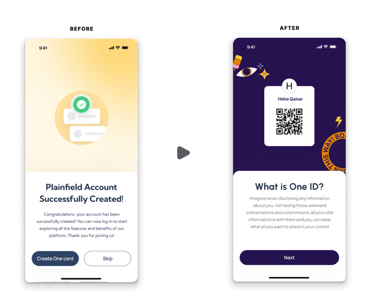
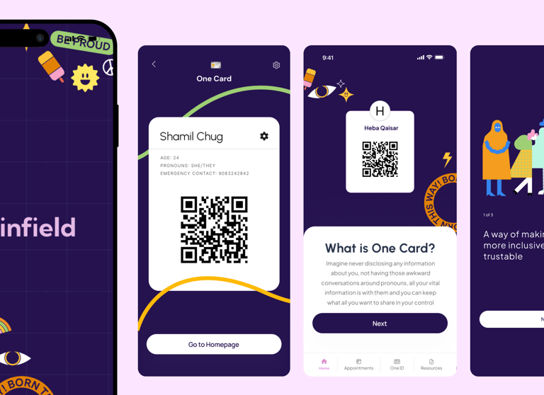
2. Strategically Positioning
the "One ID" Feature
Moved sensitive onboarding to later in the user journey
to build trust first.
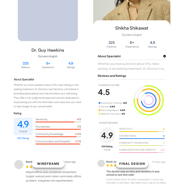
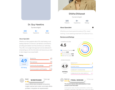
3. Introducing the "Plainfield Score" for Doctor Verification
Developed a doctor verification system to highlight queer-affirming care.
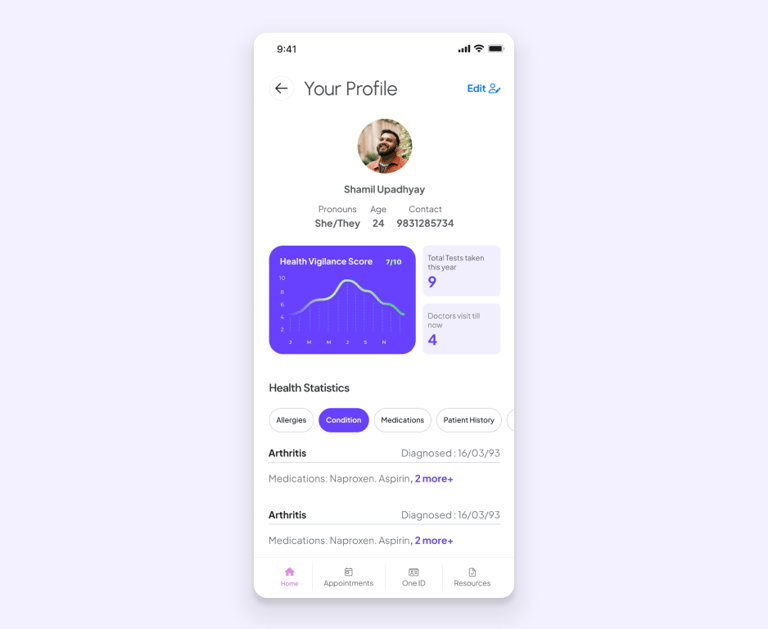
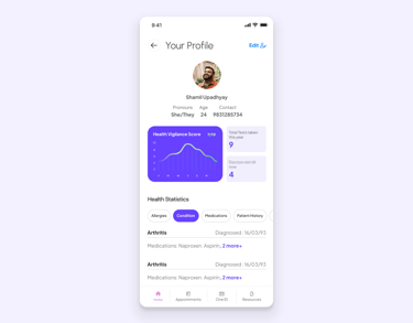
4. Personalizing the User Profile with the "Health Vigilance Score"
Personalized user profiles to motivate proactive health management.
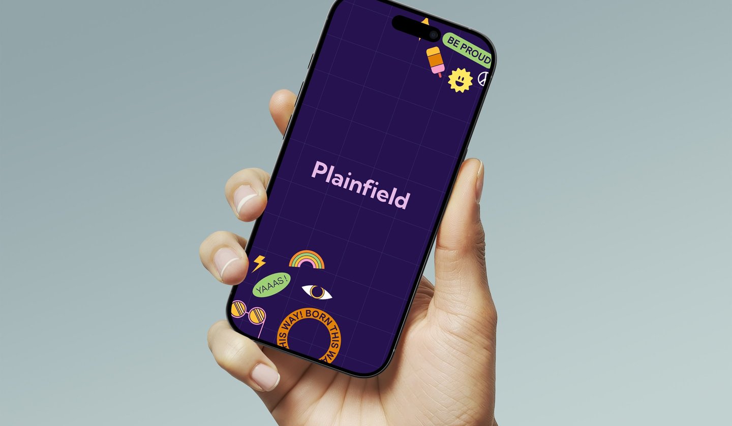
5. Infusing the App with Queer Identity and Creating a Welcoming Environment
Adopted vibrant, inclusive design language for a welcoming environment.
Testing to validate and
final version
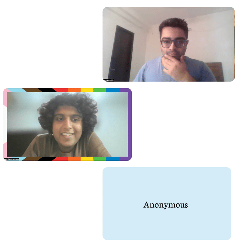
3 users were asked to make a booking of a doctor on the app and these were some of the things that were identified/pointed out by them:
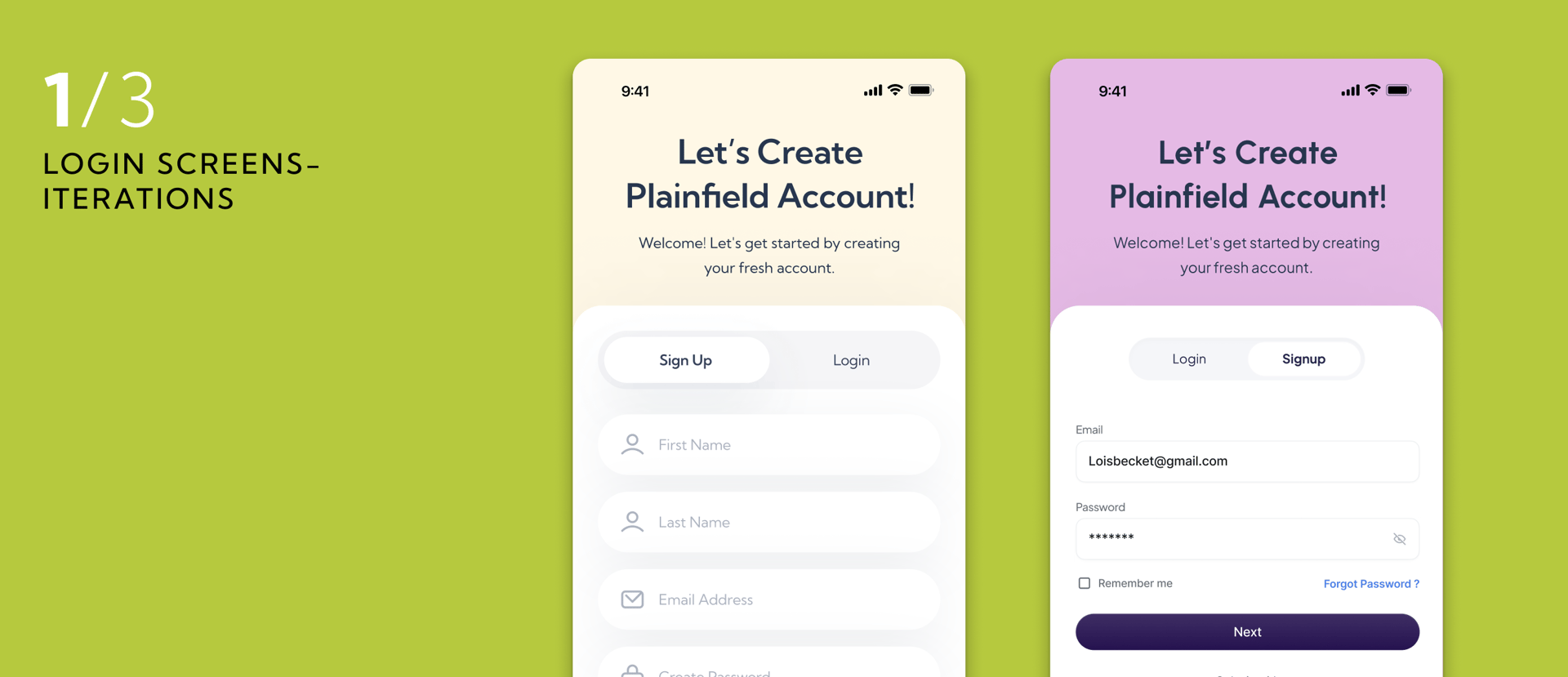
To make the login process a bit easy and add login through socials
Skipping option before login to ensure user can explore the app before making a choice to weather to login in further or not
The idea of one card is bit busy, its not given enough context and it feels like its not the right place as the user dont know much about the app let alone one card
Slightly more medical language can be used in questions asked as it might feel a little intrusive right now
Emergency contact can be somewhere else, maybe post the booking
I would not put people story and resources on the app on the home Screen as a user might get distracted
Home Screen is too simple and does not really look like the home screen
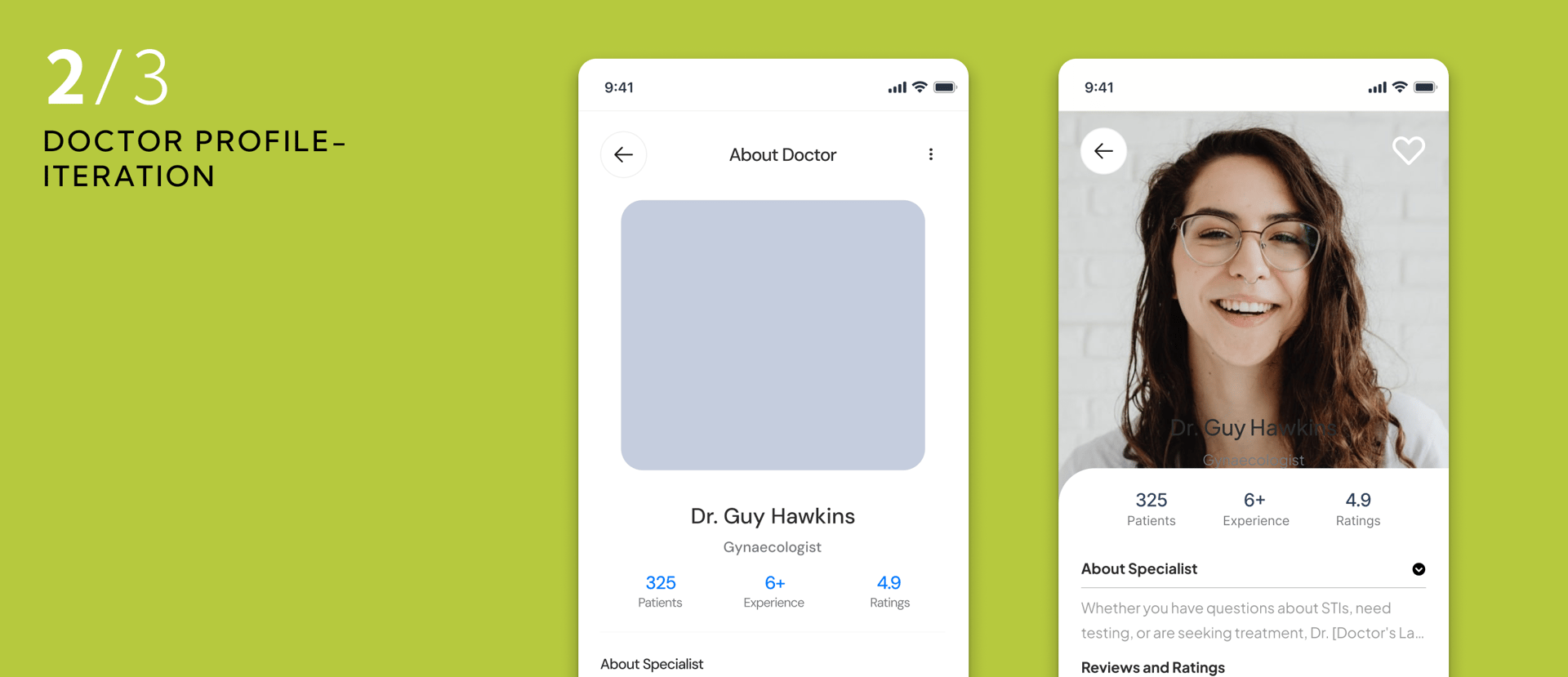
should add a Location view (where the location was collected) for doctorsDoctor profile: the about/specialisation should be deprioritised