Sukoon Villa: Unfolding the Himalayan story
UI Design | Collaboration with StikkmanUX
Time Period: 3 Months
Key Skills: Journey Maps, Sketching, Information Architecture, Design System
The Challenge: Bottling Essence in Pixels
Imagine standing on a sun-drenched verandah in the heart of Kumaon, inhaling the crisp scent of pine, feeling the rhythm of pahadi life, and experiencing the unique warmth of a traditional yet luxurious home. This is Sukoon Villa. Our challenge was not merely to build a website, but to translate this deeply sensory and immersive physical experience into a compelling digital presence. How do we convey the essence of Sukoon Villa through the flat plane of a screen, making potential guests feel the place long before they make the journey? This required a blend of strategic marketing, nuanced user experience design, and evocative brand storytelling.
Competitive Analysis: Benchmarking the Digital Landscape
Before defining our own narrative and structure, we conducted a competitive analysis, mapping out the digital presences of comparable properties and alternative booking platforms
Mapping out our positioning v/s competition
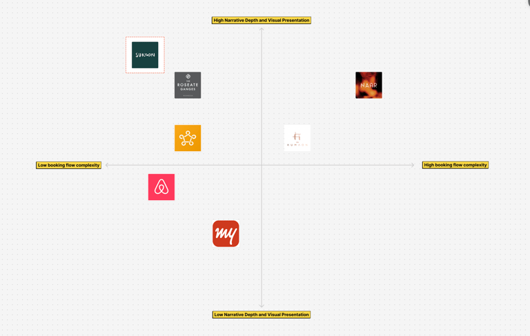
Taking a look at the competitors
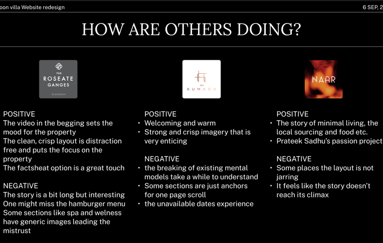
This analysis provided crucial insights into existing market approaches and helped identify opportunities for differentiation through a unique digital experience.
Discovering the Narrative: Engineering Brand Storytelling
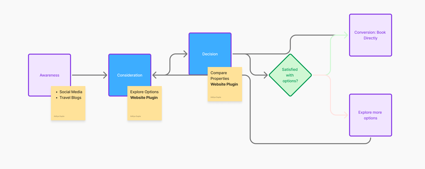
With a clear understanding of the competitive landscape and the strategic goal of driving direct bookings by targeting users in the Consideration and Decision stages, the next critical step was to define the core brand narrative. How should the story of Sukoon Villa unfold digitally to resonate deeply with potential guests and provide the compelling differentiation needed to drive conversion? This wasn't just about listing amenities; it was about creating an emotional connection and providing robust, experience-focused content that addressed user needs at these crucial evaluation points.
Idea 1: The Host's Vision
We embarked on a divergent ideation process, exploring multiple narrative frameworks that could capture the villa's unique spirit:
A personal narrative presented as a letter, leveraging typographic design and textural elements to evoke the tactile feeling of handwritten correspondence and the host's personal touch. This focused on building an intimate connection through the founder's story, appealing to users seeking a personal, authentic connection during their Consideration phase and building trust for the Decision.
Developing a highly interactive experience, perhaps using 3D visuals or video game-like navigation, allowing users to virtually explore the property and its surroundings, becoming the protagonist in their own pre-arrival journey. This prioritized immersive user experience (UX) to build strong engagement and a deep understanding of the space during Consideration, reducing uncertainty before the Decision.
A personal narrative presented as a letter, leveraging typographic design and textural elements to evoke the tactile feeling of handwritten correspondence and the host's personal touch. This focused on building an intimate connection through the founder's story, appealing to users seeking a personal, authentic connection during their Consideration phase and building trust for the Decision.
Idea 2: Immersive Exploration
Idea 3: Echoes of the Environment
Focusing intently on unfolding the rich story of the Kumaon region itself, positioning Almora not just as a location, but as a repository of unique culture and heritage. This narrative would delve into the cultural tapestry of the area, showcasing specific elements like the traditional folk art of Aipan (geometric patterns adorning thresholds and walls, symbolizing prosperity and good fortune), the intricate weaving techniques such as Thumla (a type of woollen carpet with vibrant patterns), and the artisanal process of hand spinning and weaving natural fibres like local wool, the famed pashmina, and versatile hemp. This approach framed Sukoon Villa as the ideal, authentic base from which to explore this deep, untouched beauty, leveraging destination marketing and highlighting the villa's connection to local heritage as a powerful market positioning opportunity designed to appeal strongly to travelers seeking rich cultural experiences during their Consideration phase, providing compelling reasons to select this specific location and property for their trip.
Idea 4: Destination as Narrative
Centering the story around the authentic Himalayan cuisine prepared by the in-house chef, weaving in the story of the property and the region through the lens of food – highlighting sensory details and local flavors. This focused on a specific, compelling aspect of the unique selling proposition (USP) to make the offering more tangible and desirable during evaluation (Consideration), adding another layer of appeal for the Decision.
Idea 5: Culinary Journey
Following presentations and collaborative discussions, Narrative Idea 4, with its deep dive into the destination's cultural elements and its inherent richness for storytelling, emerged as the most resonant and strategically aligned approach with the client's vision for brand positioning and conveying authenticity, providing the robust, experience-focused content specifically needed during the Consideration and Decision stages to drive direct bookings.
PRIMARY RESEARCH: Survey Key Finding
A survey was conducted to further understand how daily interactions looks like between a user and their existing health app. How regular that interaction is? What is keeping them happy on their existing platforms and What is not keeping them happy? Also try to understand thier inclinations towards more alternative practices like Ayurveda, Yoga or other wholistic practices. These were some of the findings after surveying 60 people recruited using social media posts, peers, friends etc. from Tier 1 and 2 cities of age group 18-34:-
Design & Implementation: Bringing the Narrative to Life
The selected narrative framework (Destination as Narrative) and strategic decisions, particularly the focus on the Consideration and Decision stages and the emphasis on engagement metrics, directly informed the design process. Our initial wireframes and prototypes explored how the chosen narrative could be visually and interactively translated into a digital experience, prioritizing large-format visuals, evocative copy, and seamless scrolling to create a sense of place and guide the user through the story.
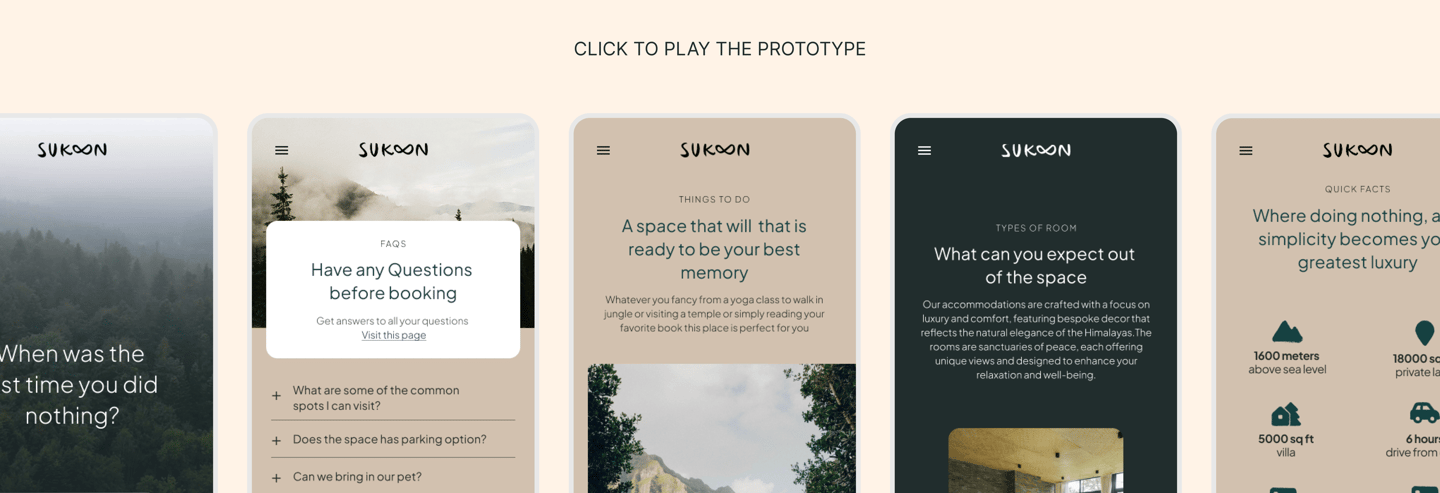
Based on testing and client feedback, we iterated on the design, refining the visual hierarchy, optimizing the user flow to ensure a smooth transition from narrative consumption to booking, and enhancing the integration of storytelling elements with functional components like the booking interface. This iterative process ensured the final design effectively balanced compelling narrative with clear calls to action, addressing the needs of users in both the Consideration and Decision phases.

Conclusion: A Digital Gateway to Kumaoni Serenity and Direct Bookings
By approaching the Sukoon Villa website as a brand storytelling and immersive UX challenge, strategically focused on the critical Consideration and Decision stages of the customer journey, we were able to design a digital experience that truly reflects the essence of the property and its rich cultural context. Through strategic placement within the conversion funnel, a carefully crafted narrative that deeply explores the destination's heritage (including Aipan art and local weaving), data-driven design decisions based on engagement metrics, and a commitment to controlling the user experience outside of standardized platforms, the Sukoon Villa website successfully serves as a powerful digital gateway. It invites potential guests to feel the serenity, unique character, and cultural depth of this Kumaoni paradise before they even begin their journey, effectively guiding them through their evaluation process and converting their interest into valuable direct bookings, thereby achieving the core business objectives. It stands as a testament to the power of integrating compelling storytelling with strategic UX and marketing principles to create meaningful digital connections that drive tangible business outcomes.