Redesigning the Ethane Production Dashboard for better actionability
This case study details my approach to redesigning Ingenero’s Ethane Production Dashboard—an industrial SaaS platform. What began as a straightforward UI/UX overhaul evolved into a deep dive into complex user needs, system workflows, and actionable data visualization.
79%
1.25 min
reduced Time on Task
Task Success Rate
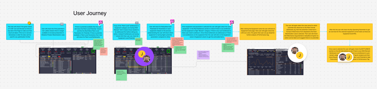
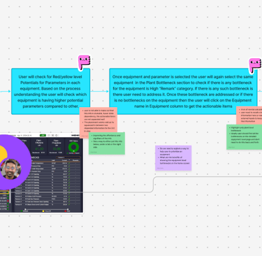
As I delved deeper, the complexity began to unravel. By focusing on the project's core objectives and the platform's functionalities, I started making sense of the chaos. Conducting a UX audit, I unearthed critical issues that demanded attention.
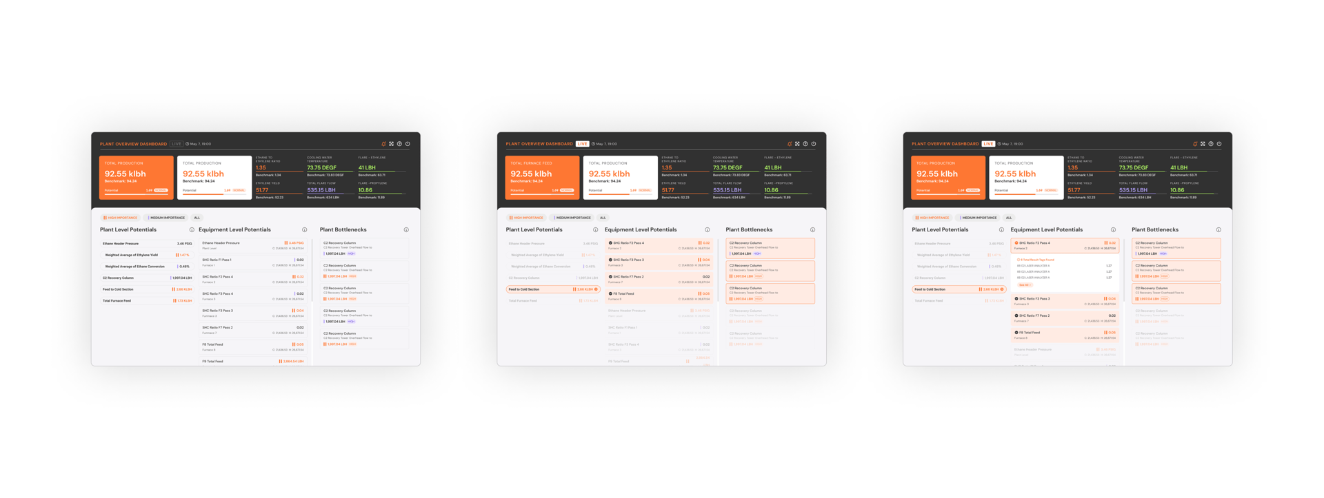
Problem Overview
5W1H
Who is the user?
Engineers and operators at Ingenero's biggest client who monitor and manage ethane production using the dashboard.
Picture a busy factory where engineers watch big screens filled with numbers and charts. These dashboards help them control the machines, spot problems fast, and keep everything running smoothly. A clear, easy-to-use dashboard means fewer mistakes and quicker decisions, making everyone’s job safer and easier.
What is the product?
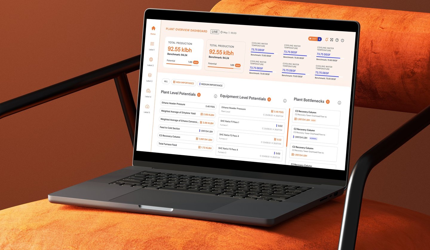
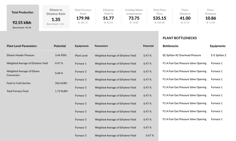
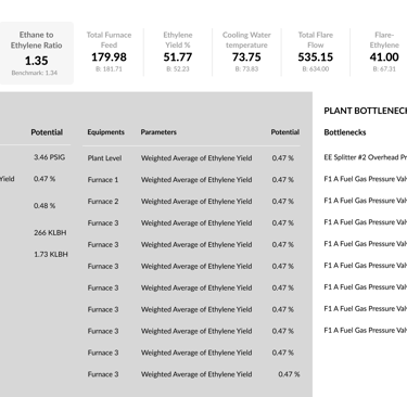
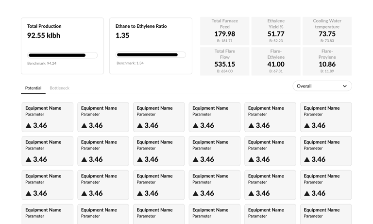
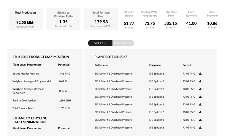
The Ethane Production Dashboard shows real-time KPIs like output and efficiency, helping factory teams spot issues and compare performance to benchmarks. It guides users to make quick improvements, boosting production and reducing downtime.
When was it redesigned?
The redesign took place as part of a recent initiative to improve usability and efficiency for internal teams.
Where is it used?
The dashboard is used within Ingenero’s client's operations, primarily by staff working on-site or remotely to oversee production.
Why was it redesigned?
The dashboard was redesigned because the old version was cluttered and hard to use, causing confusion and slow decisions on the factory floor. Ingenero’s team often had to visit the client’s plant in person to explain how the dashboard worked, which meant spending extra time and resources on training. The new design makes the dashboard much easier to understand, so users can get started quickly and work confidently on their own.
How does it work now?
The new dashboard uses clear navigation, grouped KPIs, dark mode for accessibility, and visual cues to help users make faster, better decisions with less effort.
Visual and
Cognitive Load
Excessive and scattered information led to user fatigue and decreased efficiency.
Poor Information Grouping
Related elements were not visually proximate, hampering usability
Insufficient Affordance
& Feedback
Users found it hard to interpret system responses to their actions
Contextual Clarity
Issues
Users lacked the necessary context for confident decision-making.
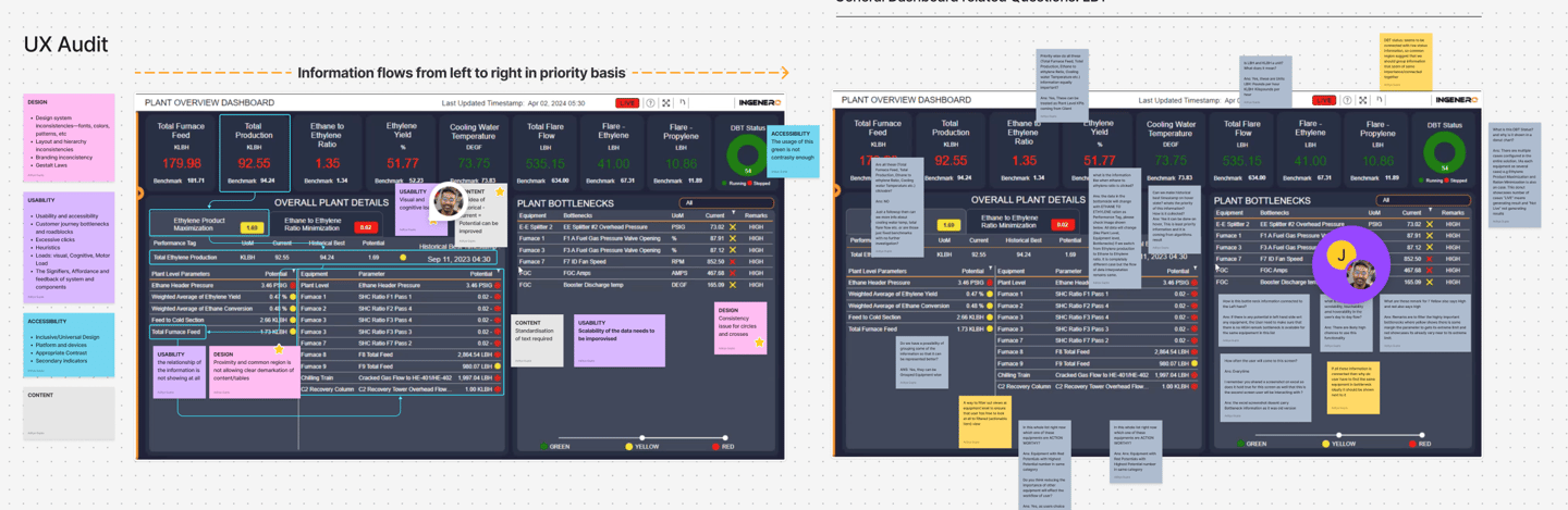
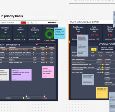
Key Challenges Identified
I ran a full UX audit, talked to users, and studied workflows. We tested wireframes and prototypes to get feedback. The redesign focused on cutting out repeated info, making navigation clear, highlighting key KPIs, and making buttons and actions easy to spot.
Reducing Redundancy
Improving Information Hierarchy
Prioritizing Actionable Items
Enhancing Affordance & Signifiers
Solution Process
Option 1: Similar with Adjustments
Streamlined content for clarity, used white space and color for better visuals, kept the core design, and separated information with clear visual cues.
Option 2: Focusing on Equipments
Prioritized key actions, grouped related info, gave users a clear path, and focused only on what’s relevant for each piece of equipment.
Option 3: Focus on Overall
and Equipment Level
Used user journey insights to boost usability, showed only essential info, made actions clear, and simplified navigation for both overall and equipment views.
Final Design Solutions
Consistent Indicator System: Developed universal KPI indicators to support rapid decision-making.
Clear Navigation Patterns: Established mental models and F-pattern visual paths to guide users.
Dark Mode Integration: Added dark mode for improved accessibility and alignment with user preferences.
Bird’s Eye View: Ensured essential dashboard elements remained prominent for holistic monitoring.
User Testing & Outcomes
Internal teams and customer satisfaction groups tested the prototype. Feedback highlighted:
Reduced cognitive load through improved content separation.
Enhanced reachability of KPIs via notification-like indicators.
Increased usability in varied lighting with dark mode.


Impact & Learnings
Trust in Iterative UX Process: Continuous refinement led to actionable insights and a user-centered solution.
SaaS Accessibility: Complex workflows became intuitive through targeted design system improvements.
Benchmark for UX Standards: The redesigned dashboard set new standards for usability and information architecture within the organization.
Scalable Design Principles: Affordance, signifiers, and feedback practices were adopted across other company projects.